
If you’re like many small business owners or clients I’ve worked with, you may love the idea of a rotating image slider at the top of your website. It moves, it grabs attention. But while sliders once where a cutting-edge design feature, they’ve quietly gone out of style for good reasons.
In this article, I’ll break down what sliders are, why they’re no longer standard practice in modern web design, and why replacing them with a strong hero image will improve your site’s performance, message, and overall user experience.
We’ll also look at SEO data, user behavior trends, and mobile performance issues that support the move from sliders to hero images.
What Is an Image Carousel or Slider?
A slider (also called a carousel or slideshow) is a rotating series of images that typically show at the top of a homepage, right after the menu/navigation bar. Each slide often has a headline, short description, and call-to-action button. Sliders automatically move from one panel to the next, usually after several seconds, and/or have the option for a user to click through slides manually.
They became popular in the early 2010’s and were widely used in WordPress themes and across many general web design templates. They gave the ability to showcase multiple features/message in one place and added visual movement (eye candy) to a web page.
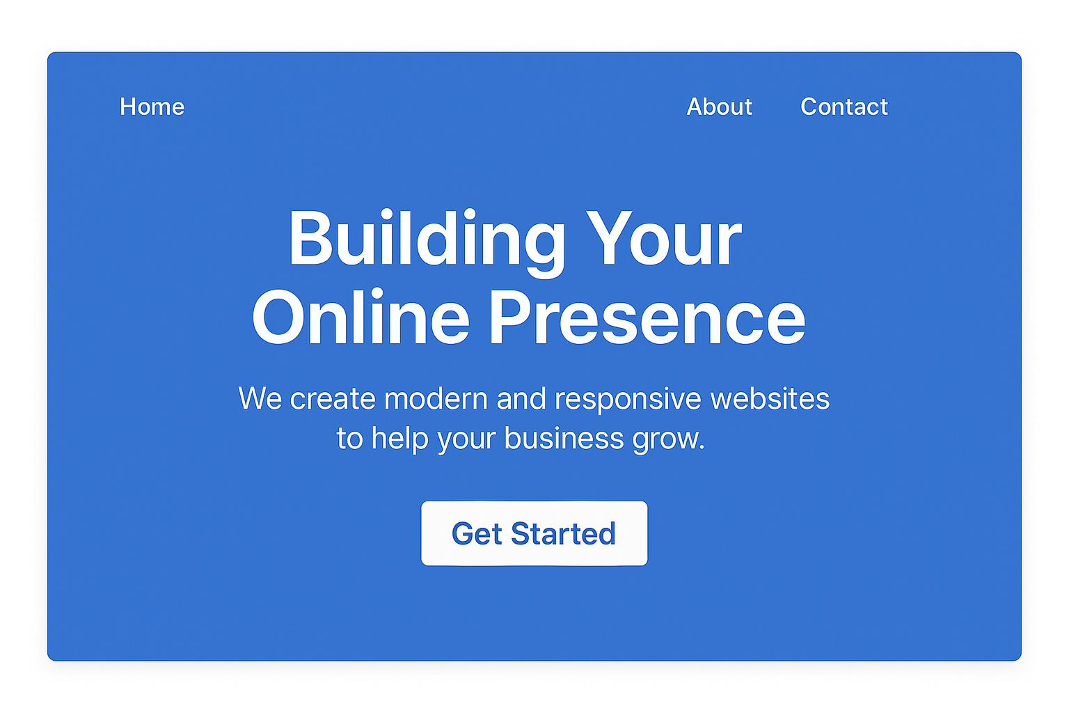
Slider Example
Why Were Sliders Popular?
Sliders looked impressive. For site owners who wanted a website that felt dynamic and modern, a slider was the go-to design element. It let you “do more” with limited homepage space by rotating several promotions, photos, or service descriptions without taking up extra room.
Around 2015 to 2018, usability experts, search engines, and developers started pushing back on sliders. Mobile use had skyrocketed. Web performance became a ranking factor. Accessibility and clarity started to matter more than visual tricks.
The data showed a clear trend: sliders were hurting more than helping.
What is the Problem with Slideshows on a Homepage?
As web design continued to evolve, the following issues have been identified with slideshows:
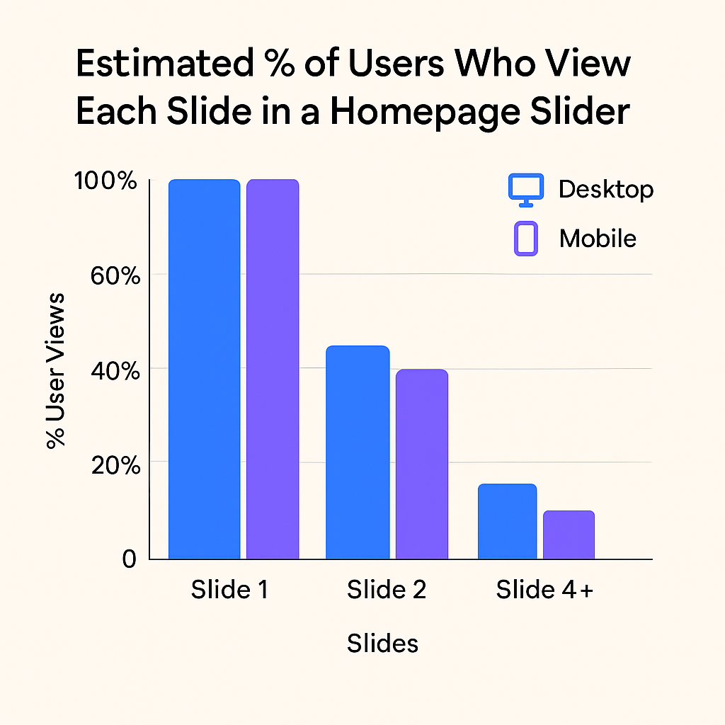
- Most Users Only See the First Slide
Research shows that over 90% of users never interact with the second or third slide. On mobile, even fewer users swipe past the first. - They Slow Down Your Website
Sliders load multiple large images and scripts. This increases load time, especially on mobile connections. A slow site leads to higher bounce rates and lower rankings in Google. - They Don’t Work Well on Mobile
Sliders often display poorly on small screens. They may get cut off or feel clunky to use. Mobile users are less likely to swipe than desktop users are to click. - They Split Your Message
A slider shows too many competing messages. Instead of one clear call-to-action, visitors get confused about what’s important. - They Hurt Accessibility
Many sliders are not screen-reader friendly. Users with visual or motor impairments may not be able to navigate them. - They Get Ignored
Users often scroll past sliders without reading them. This behavior is called “banner blindness.”
Hero Images Have Replaced Sliders
Hero images are single large photos or graphics at the top of your homepage, paired with a clear headline and a call-to-action button. It replaces the clutter and motion of a slider with one strong, focused message.
Hero images are a better solution over sliders because they address all of the issues mentioned above. They get your visitors attention for one key message, they load faster (less code used and less images to load down the page size), they look better on mobile, they perform better for SEO.
Modern web design use hero images because they create a great first impression and guide users toward action.
How are Hero Images Better for SEO Compared to Slideshows/Carousels?
- Google loves fast websites, a single image is always going to be smaller in size than multiple images.
- Hero images are more mobile friendly from a coding perspective. There are no “moving parts” to complicate how a user interacts with the page on a mobile device.
- You have a defined keyword focus, optimizing your content for a single message
- You don’t overwhelm the site visitor with multiple messages flashing quickly.
A Simple Analogy
Compare a slideshow like five billboards, each flashing for a few seconds. You only have time to glance at the first one before the next appears. Most people will miss the message.
A hero image is like one billboard that clearly tells people what you do and where to go next. It works.
Hero Section Example
Are sliders bad for SEO?
They can be. They can slow down your site, dilute your main message, and are less mobile-friendly. All of this can hurt search engine rankings.
Do image carousels hurt website performance?
Yes, they absolutely can when if you are not taking the technical aspects of coding a website, performance optimization, accessibility and how they load on a mobile device into consideration. To simplify it, it takes more code and more images to make a carousel rotate on a page, so there is more code and mote images needed. This instantly increases the size of your web page and the potential to complicate things.
What is the best size for a hero image?
It depends on your layout, but a good rule of thumb is 1600px wide by 500 to 800px tall. The image should be optimized for speed (and search engines).
Can I still use a slider somewhere else on the site?
Sure, if it makes sense contextually (e.g., a photo gallery or product showcase). But not in the hero area of your homepage.
What if I want something more “eye-catching”?
You can still make a strong visual impression with a high-quality hero image, bold headline, engaging copy, and subtle animation without relying on a slider.
Designing a web page goes well beyond just making it look good. There are concepts to apply to it that work. Working with an experienced web designer take their advice – it’s backed up by research to prove it.
If you’re redesigning your website and are looking to make your homepage look modern, clean, and professional, skip the slider. A strong hero image will do more for your visitors and your business. You will gain speed, clarity, better SEO, and higher conversions. You want a website that works right?
Closing question- Do you remember what was on the second or third slide in the example above??